PROJECT
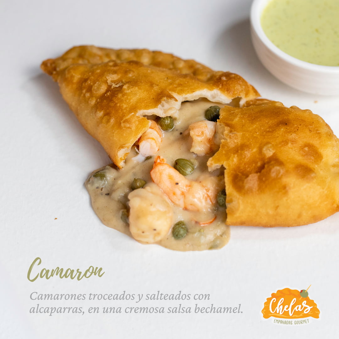
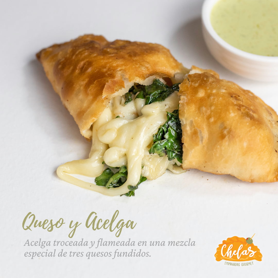
Create a Brand Identity for a fast food local service offering empanadas with distinctive gourmet fillings
This business required a full identity to break into the market with a clean and forward message, to create awareness and recognition of the brand. After researching the related market, I decided to go with a warm and optimistic personality as the best fit for this business. The name "Chelas" comes from the owner's mother's nickname and it was picked to complement the personal and warm character of the brand.
Concept
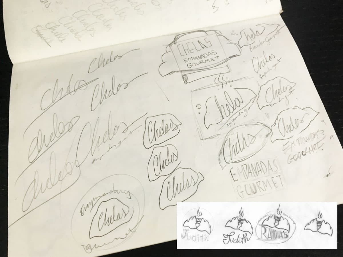
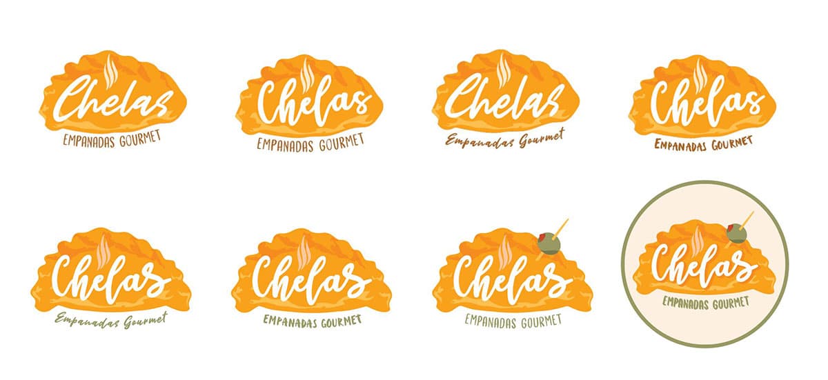
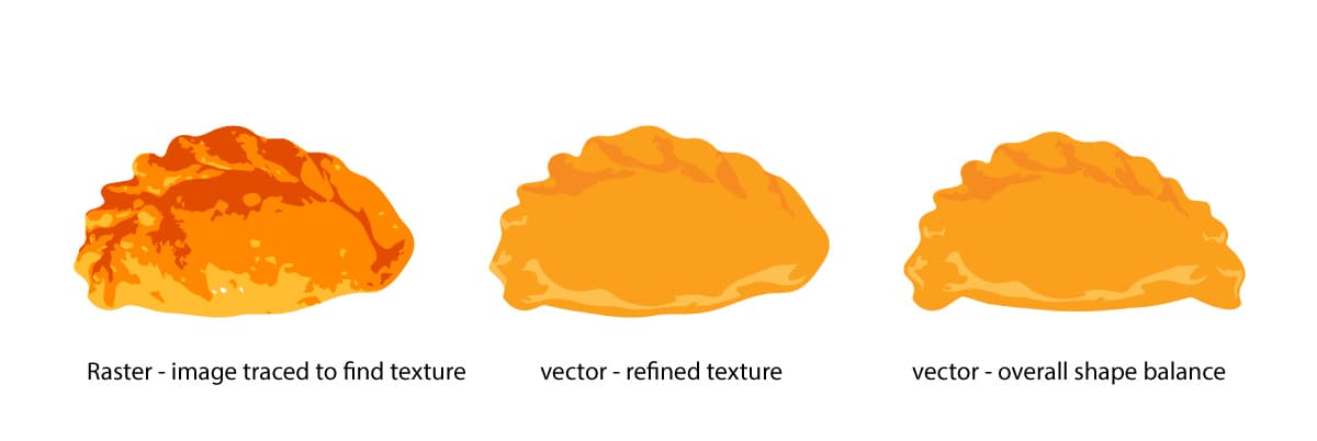
For the logo, I decided to go with a pictorial logotype displaying the main product in a provocative way to highlight its gourmet quality. The shape of the empanada was stylized from an original photograph to capture the organic shape and texture. The typography mimics the aioli sauce dribble on top of the product as its served. Finally, the garnish complements the overall balance, shape, and color.

Design Process
Logo
Final Logo
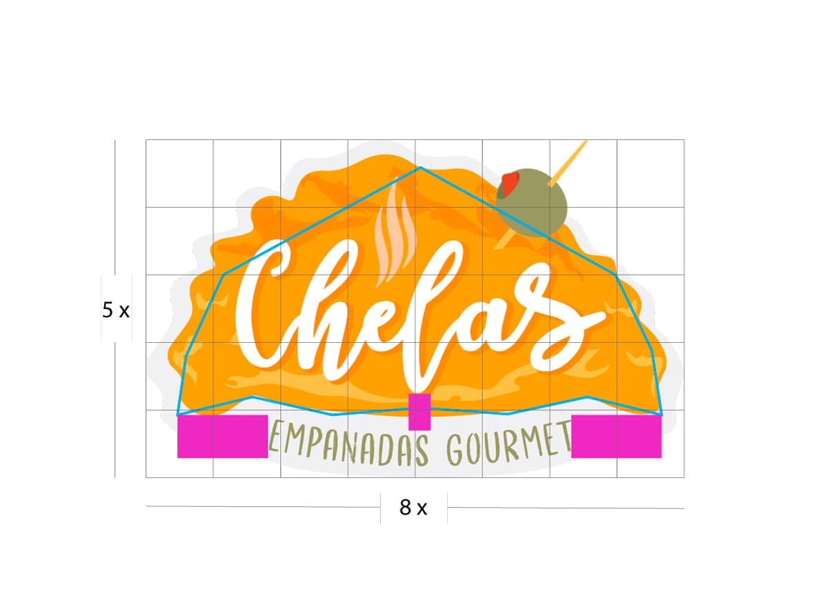
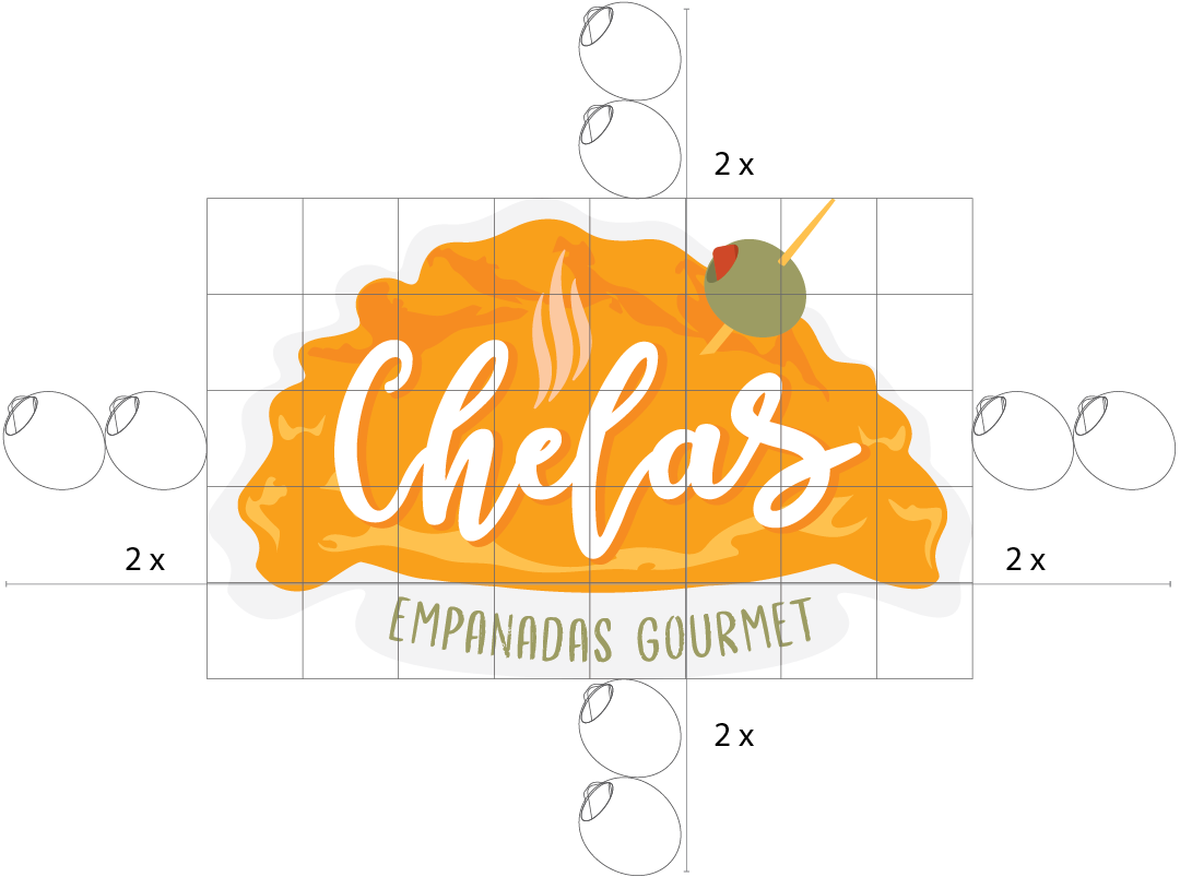
Structure and alignment
Color Palette
Versions
Flat inverted
Light
Sticker
.png)
icon

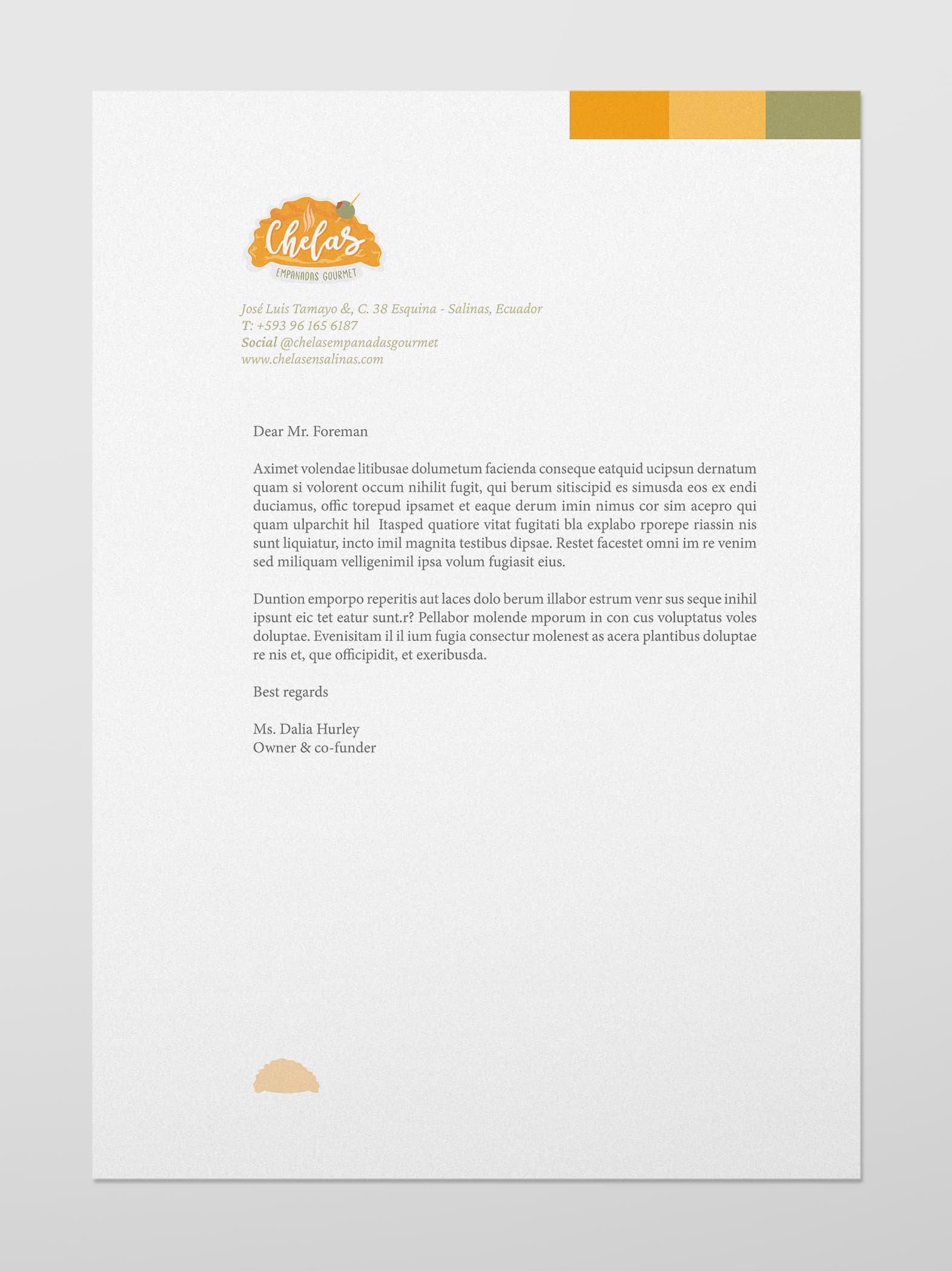
STATIONERY
